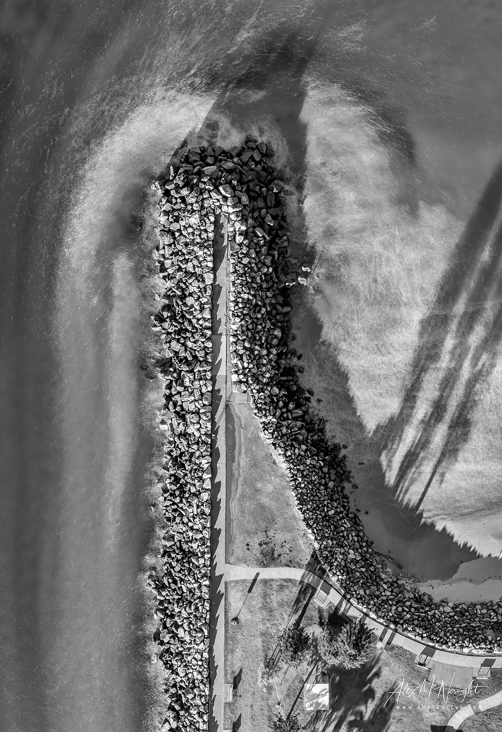
The Point Artwork selection 2021
The images below are displayed here to give a better idea as to appearance.
Please bear in mind the following important points:
-
Screens typically differ to printed paper in terms of darkness and lightness representations.
-
Your individual screen brightness level and display technology used also affects image viewing and may differ even compared to other screens.
-
Printed material lightness/darkness will be affected by ambient light levels as well as the paper type.
-
Only a specifically (and expensive) colour calibrated monitor using the exact "profile" matched to the actual paper being used will give a true appearance.
-
Typically, unless specifically setup to be otherwise (as per above), printed versions tend to look slightly darker than screen viewed versions due to the fundamental differences between the technologies used and variations in screen displays.
Nevertheless the best effort has been made to make these web based images a good representative example under most typical screen viewing conditions.
For any questions please don't hesitate to contact Alex at hello@roving-eye.com
Move the mouse over the image below and use the scrolling arrows on either side to move between images or click the image to open a smaller version with arrows to navigate between images


